task #8599
openTypeDesignation details pane: clarify function of the remove buttons
0%
Description
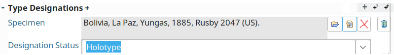
The TypeDesignation details pane offers two identical buttons with the trashcan icon, both show "Remove" when hovering over with the mouse:

I could not find by what these to buttons are different. But I guess that one will remove the type from the name and that the other will delete the Specimen completely.
Files
| picture699-1.png (16.6 KB) picture699-1.png | |||
| picture430-1.png (21.8 KB) picture430-1.png | |||
| picture425-1.png (16.7 KB) picture425-1.png | |||
| picture616-1.png (17.2 KB) picture616-1.png |
Updated by Katja Luther over 4 years ago
The most right delete button removes the whole type designation and the other delete button removes the specimen from the type designation (but do not delete the specimen)
Updated by Andreas Kohlbecker over 4 years ago
- File picture430-1.png picture430-1.png added
Katja Luther wrote:
The most right delete button removes the whole type designation and the other delete button removes the specimen from the type designation (but do not delete the specimen)
Yes your are right. I also found this out after adding more type designations. For name type designations it is much more clear since the buttons are not next so each other:

For specimen type designation the different functions of these remove buttons need to be made clear, at least by setting appropriate hover texts. Much better would be a visual separation. Placing the remove type designation button one line above the form would make it clear.
Updated by Andreas Müller over 4 years ago
This behaviour is the same all over the application so users get used to it once they have ever deleted something or took part in a workshop (at least I don't know any complaints).
Having tooltips is good anyway, having slightly different buttons which indicate the semantics might be a good idea, too (only I have no idea how they should look like to make semantics clearer, any ideas?).
Much better would be a visual separation. Placing the remove type designation button one line above the form would make it clear.
Not sure if I understand this, how should this look exactly? Do you want an extraline per record only for the delete button? What ever it should look like please keep in mind that we want to keep records as small as possible.
Updated by Andreas Kohlbecker over 4 years ago
- File picture425-1.png picture425-1.png added
- Status changed from New to Feedback
- Assignee changed from Katja Luther to Andreas Müller
How about this?

this way the button group, which acts on the Specimen, is separated from the remove button for the whole designation.
Does the remove button for the Specimen always relally delete the Specimen or is it only dissociated from the type designation?
Updated by Andreas Kohlbecker over 4 years ago
- File picture354-1.png added
in the second case the layout could be also changed to
But this would require to adapt the UI in all cases where the remove button only dissociates the entity.
Updated by Andreas Müller over 4 years ago
Andreas Kohlbecker wrote:
Does the remove button for the Specimen always relally delete the Specimen or is it only dissociated from the type designation?
No, ofcourse it does only dissociate it from the type designation
Updated by Andreas Müller over 4 years ago
- Status changed from Feedback to New
- Assignee changed from Andreas Müller to Katja Luther
About the 2 examples: some whitespace is definetely better then the current solution. If we should use a new button icon as in example2 I am not sure. We should discuss this with all developers but maybe also with users. But the longer I think about it I guess it might be a good idea to have 2 different icons for completely deleting something and for simply dissociating 2 records. But need to think about it a bit more and check the consequences, e.g. what about those cases where a dialog pops up and asks if we want to completely delete or simply dissociate (e.g. media view). Which icon to use then?
Updated by Andreas Kohlbecker over 4 years ago
Andreas Müller wrote:
... what about those cases where a dialog pops up and asks if we want to completely delete or simply dissociate (e.g. media view). Which icon to use then?
I think this is a question of asking the right question in the dialog ;-)
I would favor using the REMOVE icon (cross) and presenting a question like:
The Media|Specimen|... is no longer used by any other object,
to you want it to be deleted completely or do you prefer keeping
it for future use?
[keep] [delete]